How can your website do better at selling relatively ‘complex’ products?
There can be many reasons why a customer decides not to buy from your business. Perhaps your company hasn’t yet built a strong enough reputation in its industry, or you don’t accept the particular payment method (e.g. Apple Pay) the shopper was eager to use?
On other occasions, though, the given customer might simply struggle to decide what exact product to buy. This can be a common problem for e-tail websites offering relatively complex products, such as computer software or DIY tools.
So, how can you avoid confusing or overwhelming your customers, and get those sales of your brand’s more “complicated” offerings over the line?
Avoid saying too much too soon
There might be a lot to be said about a specific product, but it doesn’t necessarily follow that you must front-load the product page with all that information.
Let’s imagine, for example, that your company sells anti-malware software. You might offer it as a subscription package where the user pays a monthly charge — but is a 30-day free trial available as well?
If so, you could prioritise publicising that — and save other details for further down the conversion funnel.
Break up on-page information into easily digestible chunks
Many web users can find it off-putting to see large chunks of text all strung together on a single webpage, especially when many of the posted details look dauntingly technical. Fortunately, you can trust our web designers to strip any unnecessary complexity out of your online store’s design.
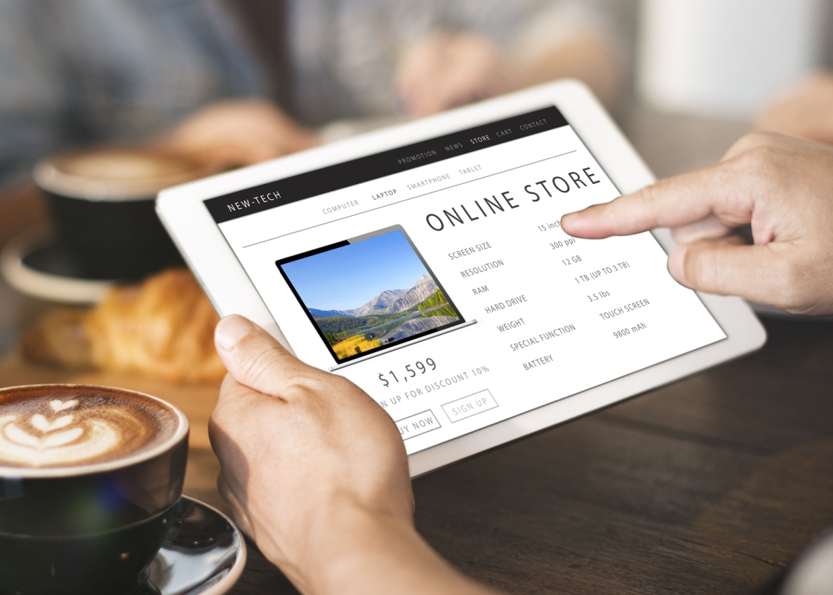
A product page for a laptop might include details of its “memory”, “RAM”, “USB-C ports”, and so on. But what do all these terms actually mean in terms of day-to-day use of the product?
It would be easier for visitors to find out such information if the page content was divided into modules, with each one dedicated to outlining a specific selling point of the laptop. For example, one section enthusing about a high amount of RAM could explain that this would help with multitasking.
Make on-page elements easy to distinguish from each other
What if your online shop stocks electric toothbrushes? Obviously, someone accustomed to using manual toothbrushes might wonder why they ought to switch to an electric alternative. Further complicating the matter is the fact that individual models of electric toothbrush can differ in their exact benefits and features.
However, on the product page for a given model, you can reel off notable examples of what it offers. With each point you explain, you may use a succinct, punchy paragraph with its own large, eye-catching subheading and memorable background colour.
Does the device have an especially long battery life? If so, you could devote one module to that. Can the electric toothbrush be used with an app? If the answer to that is “yes”, draw attention to it in a separate box. Our graphic designers could give you icons with which you would be able to further differentiate the sections.
Add a ‘knowledge base’ to your website
If your customer support staff tend to be inundated with the same product-related questions, why not provide informative answers to those in a “knowledge base” section of your website?
So, how can a product page link to a relevant page of that knowledge base in a manner that looks natural and seamless? Our e-commerce experts can answer that question for you.
To consult our team for their specialist advice and help with the ongoing improvement of your brand’s website, please feel free to drop us an email, or to give us a call at our Gibraltar, Spain, or UK offices.

