The saying ‘yes is more’ may have been around for a while, but it seems that with the increasing dominance of the Millennial generation, it is taking on a greater resonance than perhaps ever before. More and more of us, it appears, are trying to ‘de-clutter’ our lives, and this may even extend to what we expect from and respond to in
ecommerce stores.
Indeed, in much the same way as a tidy bedroom can assist you in finding that item you may have presumed you’d lost forever, so a minimalist website design – consisting simply of such elements as striking product imagery, some modest text and a clear call-to-action (CTA) – might make it easier for you to focus on precisely why you’re browsing that online store at all.
It’s a compelling theory – but does it stack up in reality? Well, let’s take a look at the cases ‘for’ and ‘against’ minimalist site design…
Make the right moves, and it could transform your online fortunes
In principle, there’s huge scope to par your site design down to just those elements that will help you to really make an impact, through heightened visitor engagement and conversions.
Cutting out or at least minimising every possible distraction on your ecommerce site, not least by bringing the most crucial content to the foreground, will help you to convey the messaging you really need your site visitors to know, without allowing them to become too easily sidetracked.
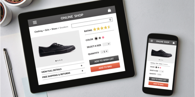
Using just a few large, emotionally evocative context-of-use product photos per page, while streamlining the site’s navigation systems to reduce how many clicks or ‘taps’ are needed to get to each destination, and deploying a white background contrasted with other colour elements, could all help to give your site a striking minimalist appeal.
You might also think carefully about the most fundamental sections that each of your product pages can be reduced down to – such as its main image, the product name, its price, a call-to-action (CTA) and a section for supporting information such as product details and technical specifications.
And of course, a key part of web-design minimalism is being ruthless about what to jettison on your site. Are your social share buttons giving you much benefit? What about those eye-catching labels that you like to use on certain products, such as ‘new’ and ‘featured’? If your store’s analytics don’t indicate they’re making a positive difference, it might be time to say goodbye to them.
Is there an argument for not being minimalistic?
The short answer is: yes. For some sites, it really is just too important to provide in-depth information and imagery that visitors can see straight away, in which case, it might be counter-productive to try to relentlessly slice away elements of your site that users may appreciate.
Nonetheless, even if you’re not specifically aiming at a ‘minimalist’
web design, there can be big advantages in keeping an eye out for unnecessary clutter on your ecommerce store. After all, by doing this well, you’ll be able to guide your visitors towards that all-important ‘buy’ button so much sooner.
Get in touch with the Piranha Designs team today, whether in Gibraltar, London or Edinburgh, for a more in-depth discussion of how we could assist you when you’re refining or – indeed – comprehensively revamping your own ecommerce presence.
